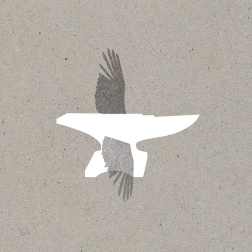
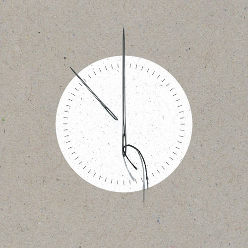
Wow. This guy’s stuff is incredible! So simple and yet so precisely thought out. Impeccable execution!
Emily
it might even just be me being backwards, but does anyone else thing that the wings in the first one might look better if they were on the other way around….
Maciel
Emily, I kind of agree with you on that one. Although maybe the artist felt the pointier (don’t know what that part of an anvil is called) better resembled a bird’s beak. I personally feel it might better resemble a bird’s tail, thus making the illustration feel a little more balanced. Regardless, these are pretty wicked.
http://birdsandbeesatpeace.blogspot.com M
he seems to use the same texture as the background for three of the four shown here.
Pingback: Фoto-inbox