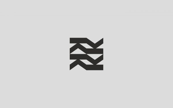
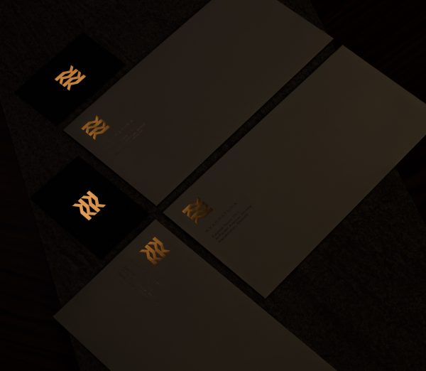
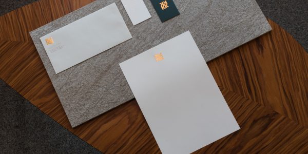
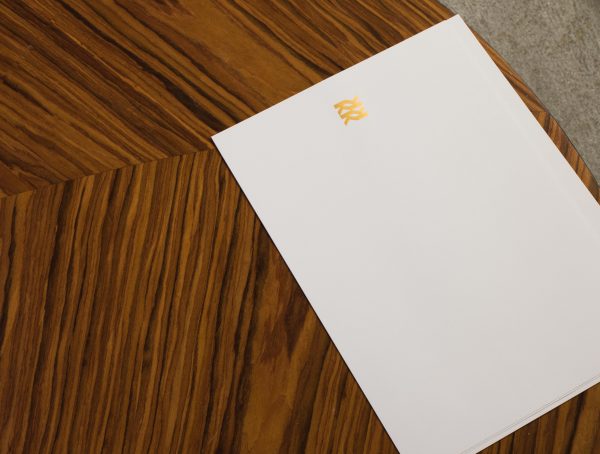
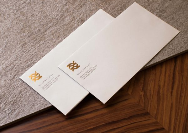
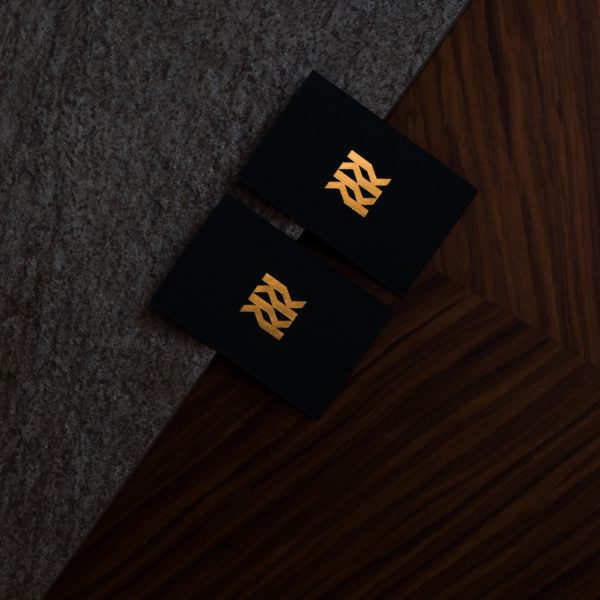
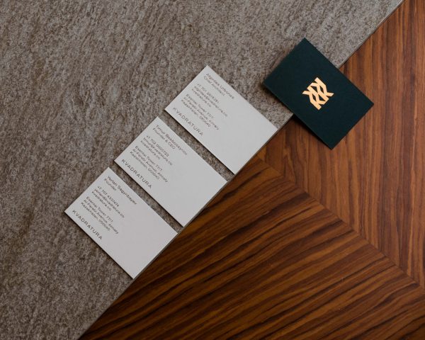
To create a concise project is to be sure of your client’s idea of its future. The team behind the new company combines experience & ambition to provide luxury & intelligent architecture ––construction solutions for investors. For the word-mark, we’ve selected a geometrical, slightly extended sans serif. Logotype is a stylistically assembled letter K, which works as a strong mark & forms moving lines. Versatility and luxurious client experience was the main focus for the design of collateral such as stationery. Colorplan Racing Green & Pale Grey paper-stock defines the new look and highlights adaptability. Finished with either matte gold, silver off-shades or blind deboss brand can target both more traditional Central Asia and modern & austere European markets.
Learn more here
