Great graphic work by Phil Yamada. (No relation to me! Our last names aren’t even the same, you racists!)
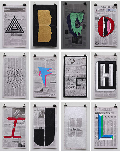
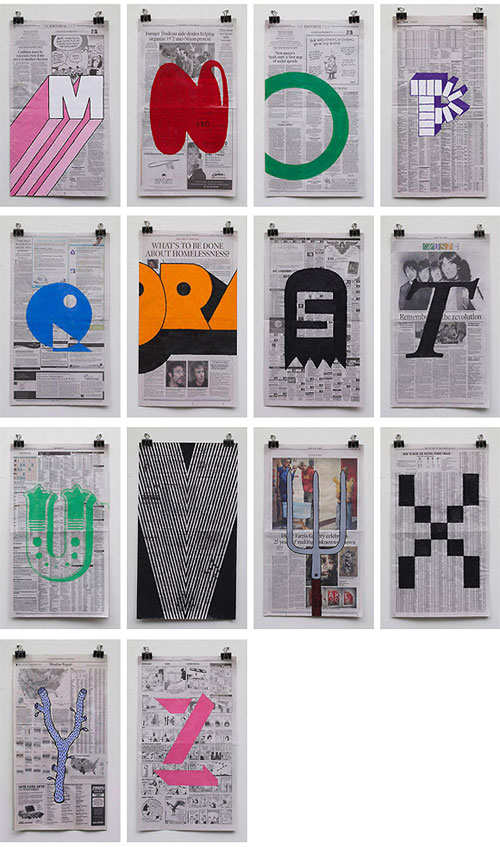
Great graphic work by Phil Yamada. (No relation to me! Our last names aren’t even the same, you racists!)
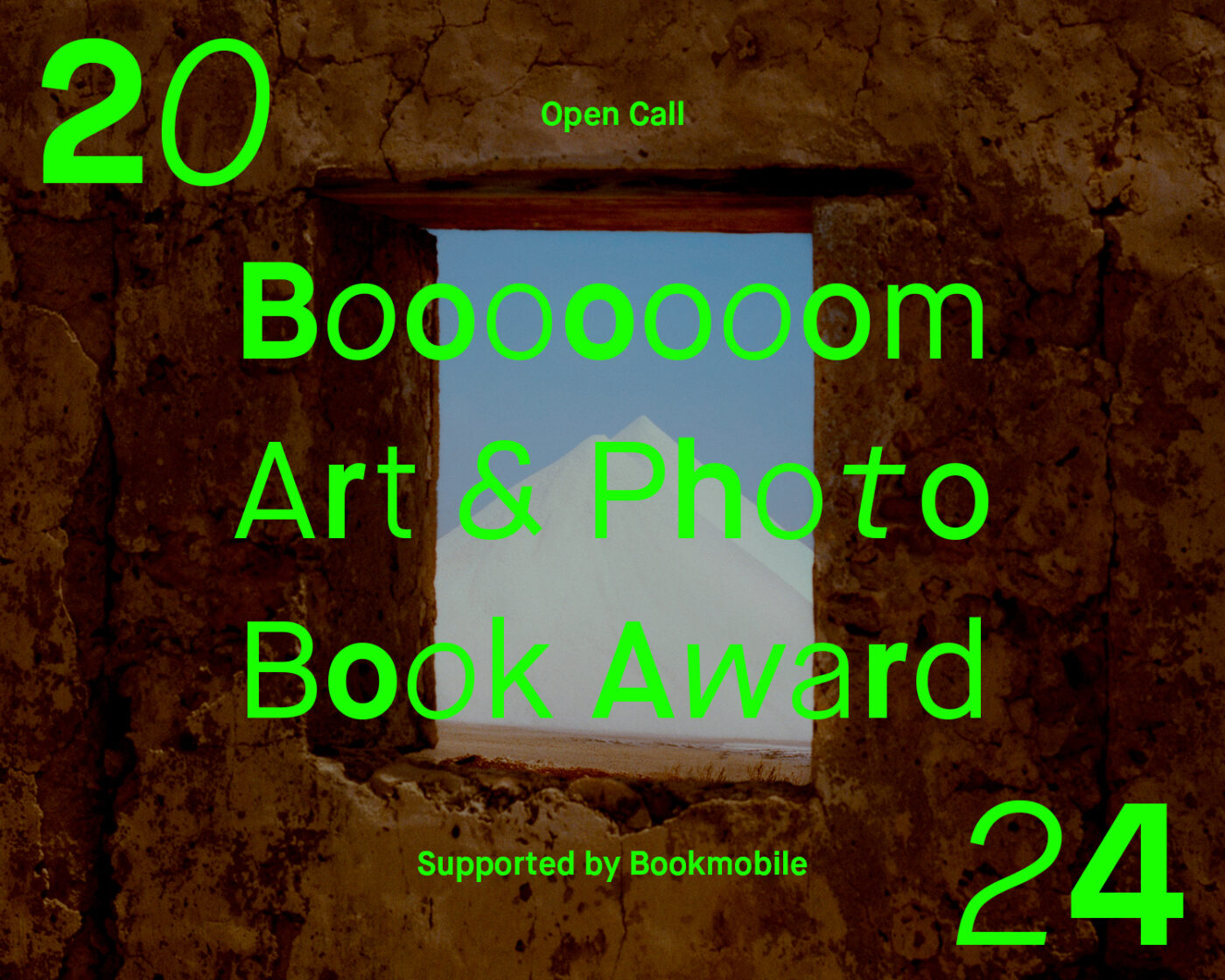
If you have a specific series or a cohesive selection of work that you want to turn into a book, we want to see it!
Learn more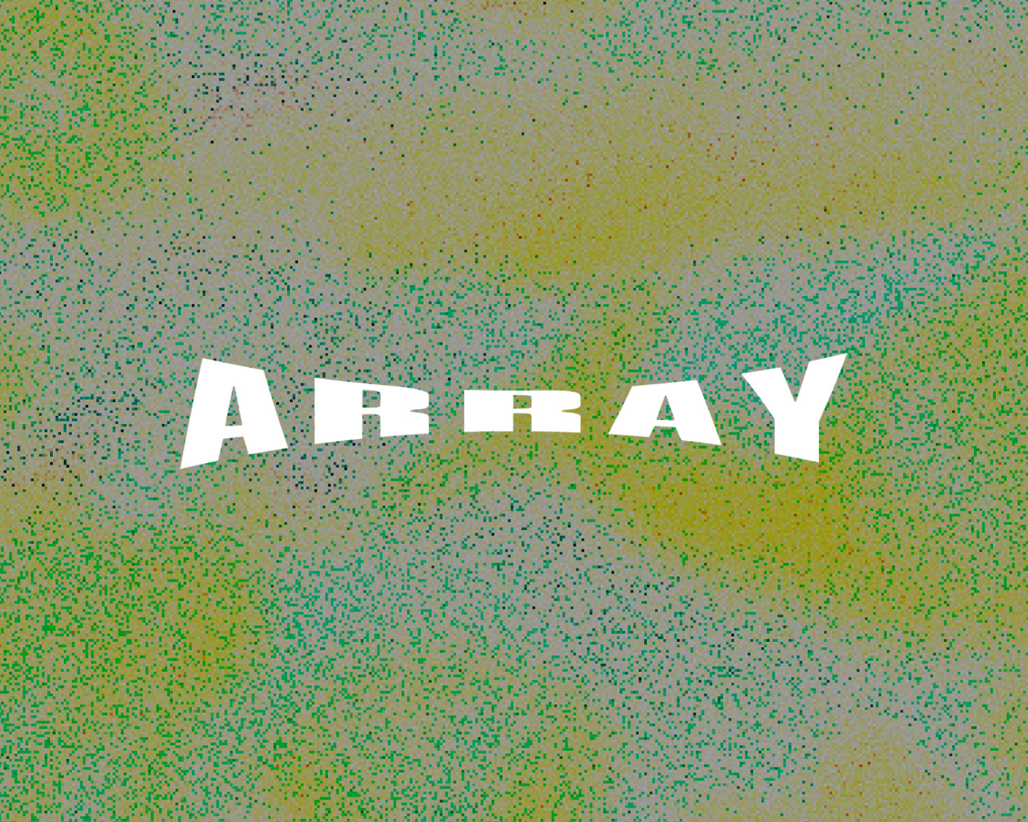
Submit single images to be featured alongside the work of other artists and photographers as a group feature.
Learn moreRelated Articles
