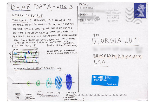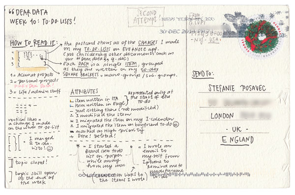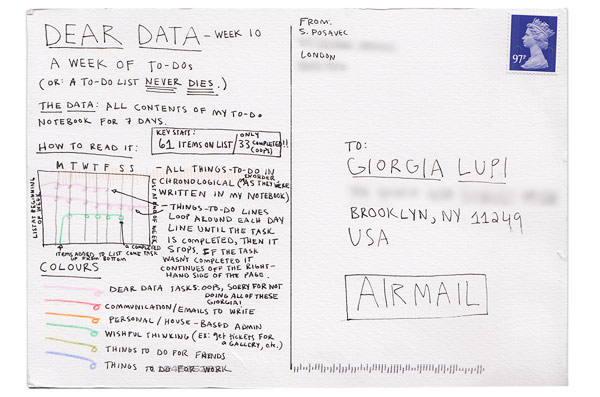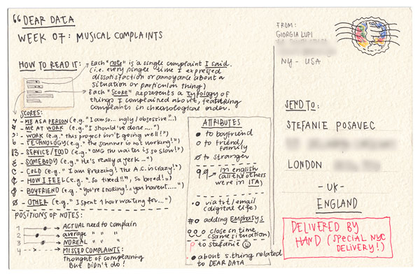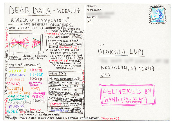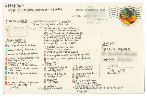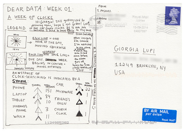
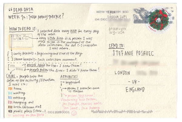
Designers Giorgia Lupi (New York) and Stefanie Posavec (London) recently launched a fascinating postcard project called Dear Data. Each week the two data artists measure one aspect of their daily lives and then represent that information with a drawing on a postcard. Every Monday they put their postcards into the mail to journey across the ocean to the other and begin collecting data for the next postcard. Having only met twice in person, this project is as much about the two of them getting to know one another as it is about finding creative ways to record details of their own lives.
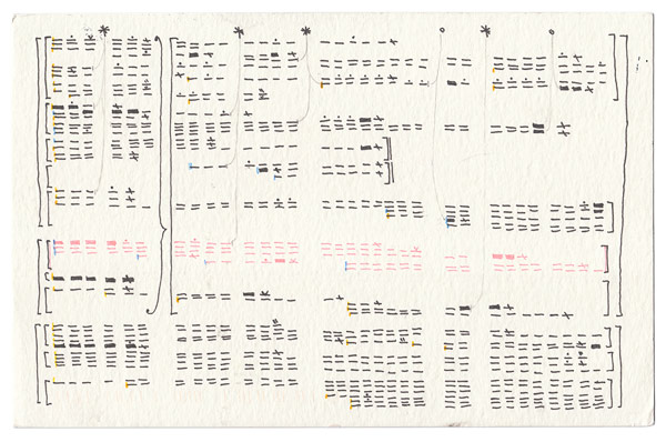
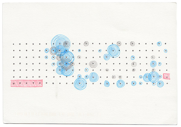
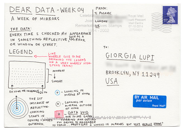
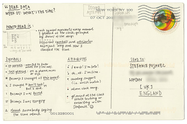
There are so many interesting details in the notes they make for each other; instructions on how to decode the often extremely abstract ways they’ve represented their findings, as well as little tidbits about their day. The topics they choose for each week vary from people and purchases they make to emotions and the number of times they look at themselves in a mirror or window.
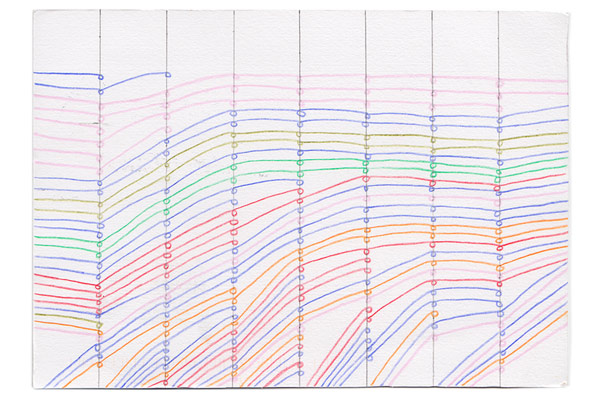
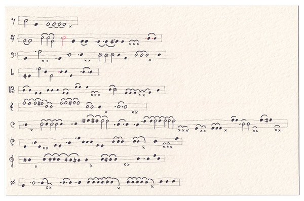
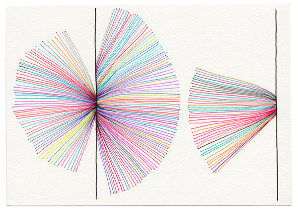
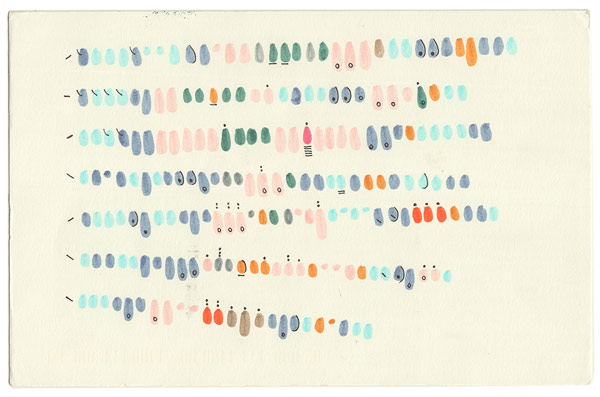
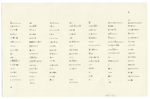
I love the analog and imperfect nature of the project; I think it makes the idea of data visualisation more accessible. I’ve included a bunch of their postcards below. Head over to their site to see larger images (they’re worth reading).