Calligrapher and type designer Sebastian “Seb” Lester is one of my favourite people to follow on Instagram (@seblester). The hand drawn calligraphy videos that he creates are so satisfying to watch that I find myself returning to them time and time again. It’s no wonder he’s amassed a following of over 1.2 million followers on his various social channels.
I asked Seb, of all the videos he’s made so far, which words have been the most fun to draw. The video above is a compilation of his favourites. A couple weeks ago I had the opportunity to ask him a bit more about his work as a sort of mini interview to accompany the video. You can read it in its entirety, a view some more videos, below.
An Interview with Calligrapher Seb Lester
Jeff Hamada: I read that after finishing up at Central Saint Martins, you moved to Lewes, England. What’s that like?
Seb Lester: I lived in gritty, urban central London for seventeen years. For the last four years I have lived in Lewes, a medieval town in East Sussex, England. It is pretty much the exact opposite of London. I feel like I have moved to Narnia.
JH: Can you describe in a little bit more detail where exactly you are right now? What’s in the room, and what do you see when you look out the window?
SL: I am in my studio. My working methods blend traditional and modern tools so my studio is an extremely chaotic blend of techno-den and medieval scriptorium. I am surrounded by boxes of paper, pens, inks, brushes, quills, books and computer equipment. A large wall in my office is covered with print outs of some of the finest letterform based work produced in the West in the last two thousand years or so. Roman Monumental Capitals, Medieval manuscripts, Renaissance Calligraphy, Seventeenth century Flemish Writing Masters, Eighteenth Century English Writing Masters and so on. I can see an 11th century Norman Castle out of my window right now believe it or not. It is one of the oldest castles in England, built shortly after the Norman invasion in 1066.
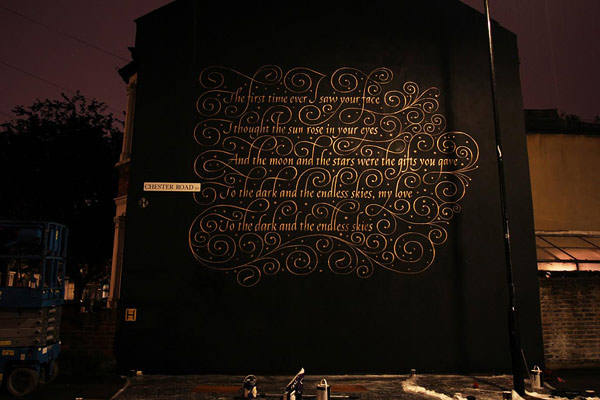
Seb Lester’s “First Time Ever” Mural
JH: What is the best trick you can do on a BMX?
SL: Ha, good question. Way back in the mists of time I could do something called a backwards rubber ride which involved standing up straight on the bars facing backwards with the bike moving forwards. I think I’ve put on about 200lbs since I last did that. I would definitely break my neck if I tried it now. I do still ride an Emer Swift cruiser BMX occasionally, which my friend Johann designed. I can wheelie around in circles for a couple of minutes, that’s about it.
JH: What did you do for fun when you were growing up?
SL: When I was a kid my life really was all about art and BMX. If I wasn’t riding my bike I was drawing and painting. I wanted to be a Pro flatlander or an artist. I think it was actually BMX that got me interested in logos and graphic design. I made this very strong association early on between the excitement of BMX and the colourful logos and graphics associated with them. This was the mid 1980’s so it was all about brands like Skyway, Haro, Mongoose and SE.
JH: How early did you become interested in drawing letters?
SL: When I was nineteen and doing my foundation course in 1992 I stumbled across a book in the college library called ‘The Graphic Language of Neville Brody’. I was immediately struck by the stark, graphic power of Brody’s work. He made letterforms look extremely cool which was a first for me. The forms exuded strength and had a simple beauty about them. It was the first time I thought about designing a typeface myself and so that’s what I started doing. By the time I left college Rolling Stone Magazine had used one of my typefaces for an article which was very encouraging.
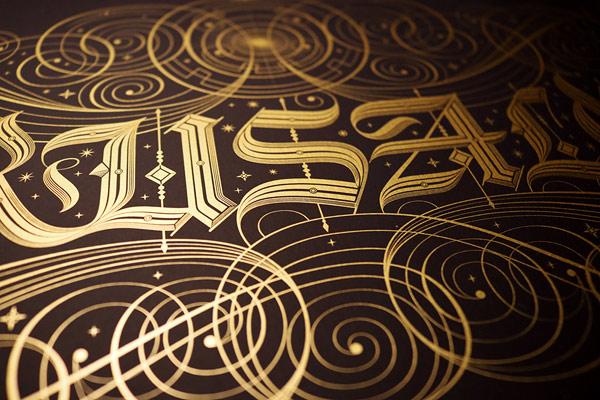
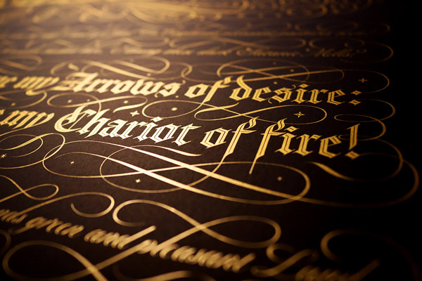
Seb Lester’s Limited Edition “Jerusalem” Print
JH: Is the practice of calligraphy a peaceful sort of release for you? Or is it more of a compulsion, like you just can’t help but do it. The latter might be more accurate for many of my friends who write graffiti.
SL: The only difference between calligraphy and heroin is you can come off heroin. I jest, but letterform creation is fundamentally about addiction and compulsion for me. I haven’t felt like I have had a lot of choice in doing what I do for a long time now, but there is a lot of peace and joy to be found along the way. I spend a lot of time drawing letterforms, studying letterforms, thinking about letterforms and reading about letterforms. I live this. It’s the only way a print like my new Jerusalem print, for example, could come about. Jerusalem was a pretty epic undertaking. Over time I have developed a strong emotional connection to letterforms. Calligraphy and lettering offer me a very powerful form of self expression. Calligraphy feels like ancient magic to me, which is of course what it is.
JH: You have more than 600,000 people eagerly awaiting your videos on Instagram, what was the thing that sparked your insane following?
SL: It is crazy, a little overwhelming at times. I am approaching 1.2 million accounts following me online at the moment. That is respectable for a pop star, let alone a nerd with a lot of pens.
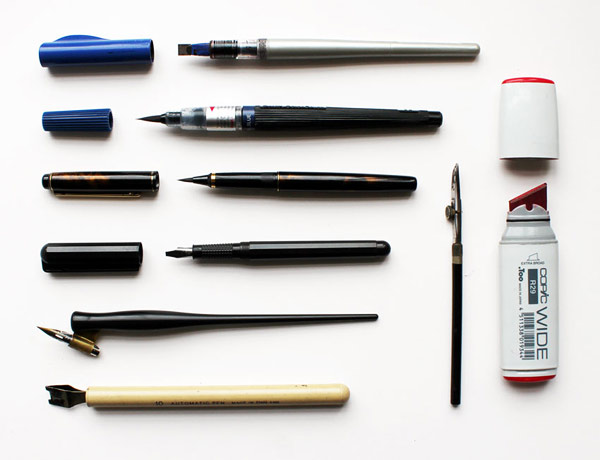
Seb Lester’s recommended tools (from top to bottom): Pilot Parallel Pen, Pentel Colour Brush, Kuretake No. 13 Fountain Brush Pen, Manuscript Italic Fountain Pen, Nikko G Nib with oblique pen holder, Automatic Pen, Ruling Pen, Copic Wide Marker.
SL: One of the big boosts was when Instagram featured one of my calligraphy clips on their official Instagram account, which had about sixty million followers at the time. Within two minutes the clip had over 10,000 likes. My Instagram following went from around 13k to 85k in 24 hours. There have been three or four projects I’ve put online over the years that have gone viral and helped create the following I now have. The most recent of which was me hand drawing famous logos with calligraphy pens. That connected with people, most people have a favourite logo, and I estimate those logo compilations have had around 100 million views online. My followers seem to come from every continent and every walk of life. The last time I looked there was a pet shop in Iran following me, a pole dancer in Las Vegas, and a kid in Mongolia was trying to emulate my calligraphy videos. That is a humbling, surreal and beautiful thing.
JH: Photo filtering apps, beat matching software, there are a lot of tools out there making it a lot easier to sort of shortcut the time it takes to “master” something. These things promote creativity but they also have a way of encouraging lazy creating. Should we be encouraging more kids to master one thing rather than be mediocre at a bunch of things?
SL: I think it’s great that technology does empower people this way and create choice. I wouldn’t be prescriptive but I am personally more interested in trying to become a true virtuoso in one field than a generalist. Specialization has worked for me. I would love to paint again, and to produce dodgy electronic music again, but I think developing a profound understanding of anything requires total commitment to that field. Profound mastery requires everything, heart and soul. A lot of love and a lot of time. I know that, even having spent twenty years working at this, I still have a lifetime of learning ahead of me.
Seb Lester’s Limited Edition “Jerusalem” Print
JH: You mentioned to me before about not wanting to take on freelance work right now
SL: If an amazing project is offered to me I will seriously consider it. I recently finished some architectural lettering for Norman Foster, and I developed a logo for a NASA Space Mission last year. But a lot of the things I set out to achieve in type design, for example, I have achieved. I love type design but I don’t especially want to repeat myself. At this point in my life I want to focus on art. I’m extremely interested in seeing what I am truly capable of producing as an artist working with letterforms, without all the constraints associated with client work. I obviously need to make a certain amount of money, but it’s not a prime motivator. It’s much more important to me that I try and fulfil my potential as an artist.
JH: Can you speak a little bit more about the importance of taking some time to make things just for yourself and no one else?
SL: All the best client projects I have worked on have come about as a result of art directors seeing my personal work, either sketchbooks or art projects. I was speaking with Donald Jackson recently who is a brilliant calligrapher, he was actually the Queen of England’s Calligrapher for nearly fifty years. He said that play working, which I took to mean experimental personal work, is the best investment I can make. I agree with him and that is one of the things I am making more time than ever to do this year.
JH: What are you most proud of so far in your life?
SL: That is a difficult question to answer. From a professional perspective I really feel like I am getting a lot of people interested in calligraphy and lettering at the moment. It appears quite a lot of people are trying calligraphy either through seeing my work, or the work of people inspired by me. Being influential, as I am told I am, and shaping behaviour in such a positive way has got to be a good thing. I’d like to continue to try to evangelize about calligraphy. It has been a source of so much pleasure to me, I want to try to share that.
JH: What’s one thing you’d like to accomplish before you die?
SL: I am ambitious. My attitude towards ambition is if you don’t set insane goals in life then how are insane things going to happen? Without going into too much detail, and sounding like a nut bar, I would like to try to become established in the art world. I would like to find an established gallery in the States to work with to help facilitate that. I’m not saying I will achieve it, but I want to try to produce work that sits comfortably with anything else ever produced in the field of letterforms. Profound, transcendent work that stands the test of time. Whether it’s the Chi-Rho page from The Book of Kells, or the beautifully audacious penmanship of Louis Madarasz in the 19th century, to give two examples, the best work has a timeless beauty.
The best work often moves and awes people. The best work may look different visually but it’s very often unified by a profound understanding of harmony, balance, contrast, proportion, rhythm, and movement. These are the main qualities that need to continue to guide and inform my work. Momentum seems to be gathering at quite a pace in my career at the moment. The road ahead is daunting but very exciting at the same time.