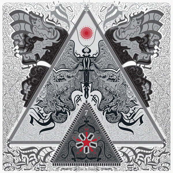
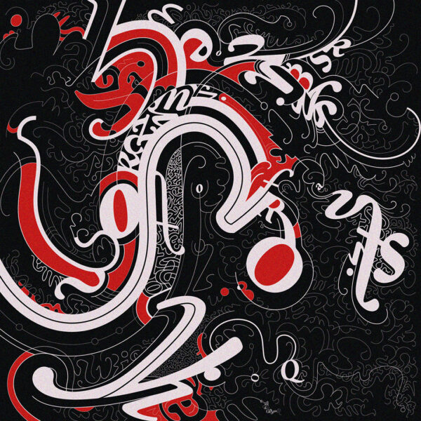
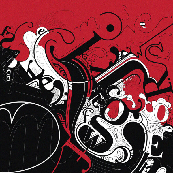
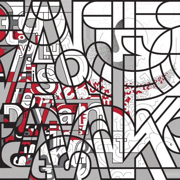
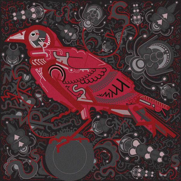
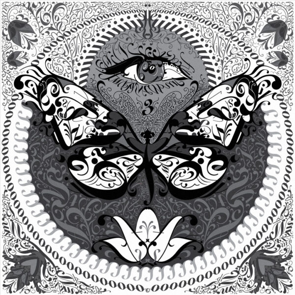
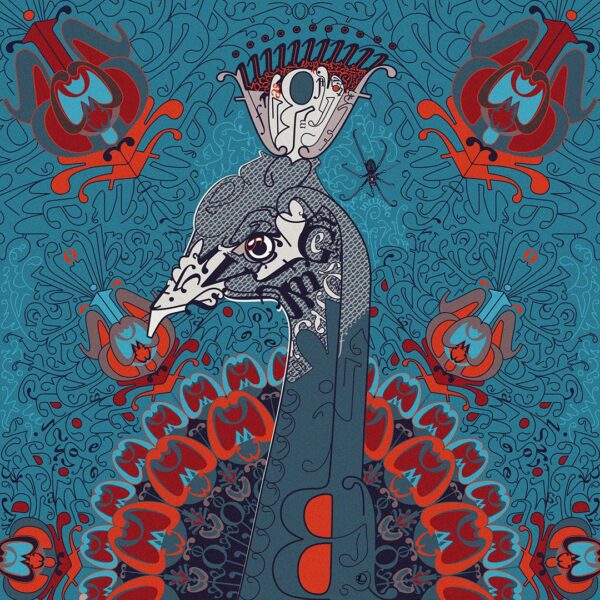
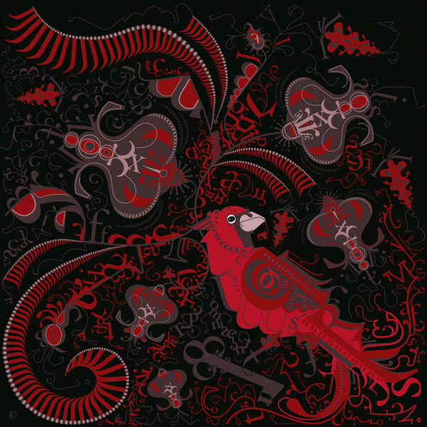
Typography is designed to disappear. The discipline of good type is to let a reader stop seeing letterforms and see only meaning. This work reverses that: letters, punctuation, and ornament are cut apart, fragmented, and rebuilt until they stop reading as language and start functioning as form. The viewer is asked to see the letter before the word - a reversal, not a destruction.
Each piece belongs to a continuing series, "Type Is..." , and draws on traditions of ornament, symmetry, and typographic experimentation. Some compositions resolve into recognizable subjects; others remain pure structure. Each carries a full title worked into it - sometimes hidden at low contrast, sometimes set more visibly within the composition, depending on what that piece calls for.
Learn more here
