We’re teaming up with Squarespace on a content series to show just how easy it is to build a beautiful portfolio site and we’ll also be highlighting some of our favourite artists using their platform. I thought it made sense to start the series by trying it out for myself (so I would actually know what I was talking about).
I’d been putting off updating my own website for months so I was happy to use this opportunity as a reason to quit procrastinating. All the images here are my photos and the screenshots are from my new website. We also have a deal to get 10% off your own site by using the code “BOOOOOOOM” on checkout! Head over here here to get started.
I’m usually looking at portfolio sites from the point of view of an editor searching for people to write about. I don’t know how many portfolio sites I’ve looked at over the past ten years but I feel like I’ve seen enough to have an opinion about what makes a good one.
Things I like:
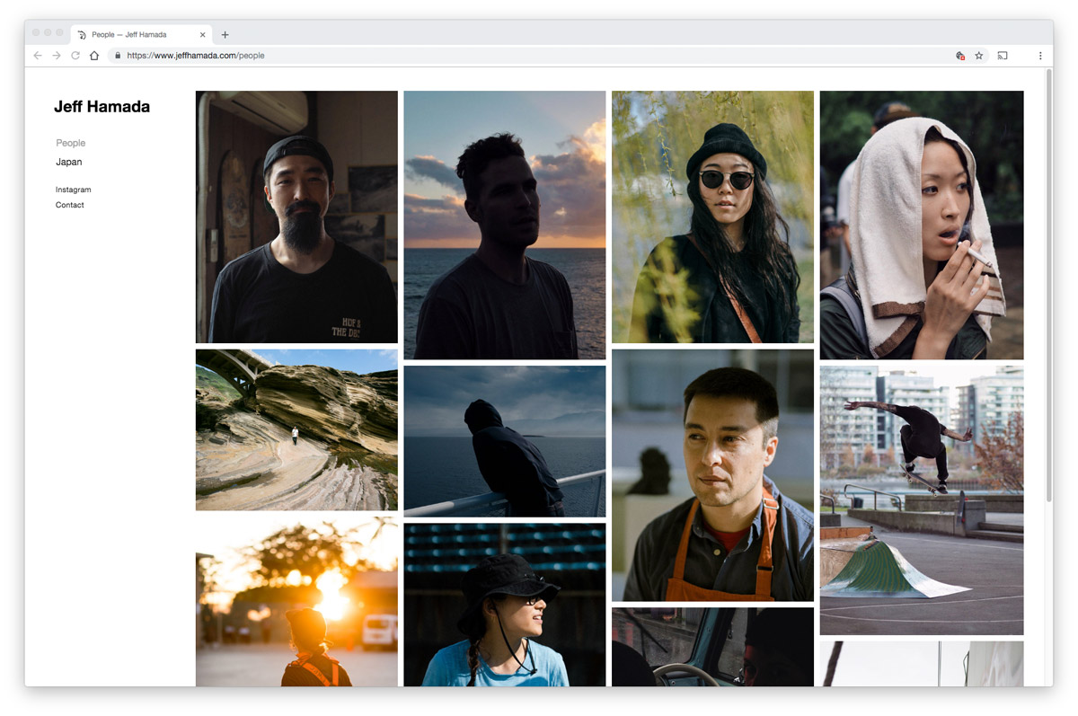
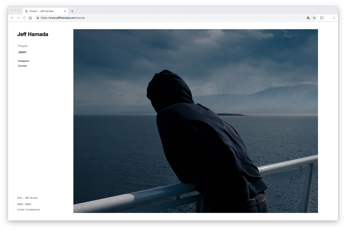
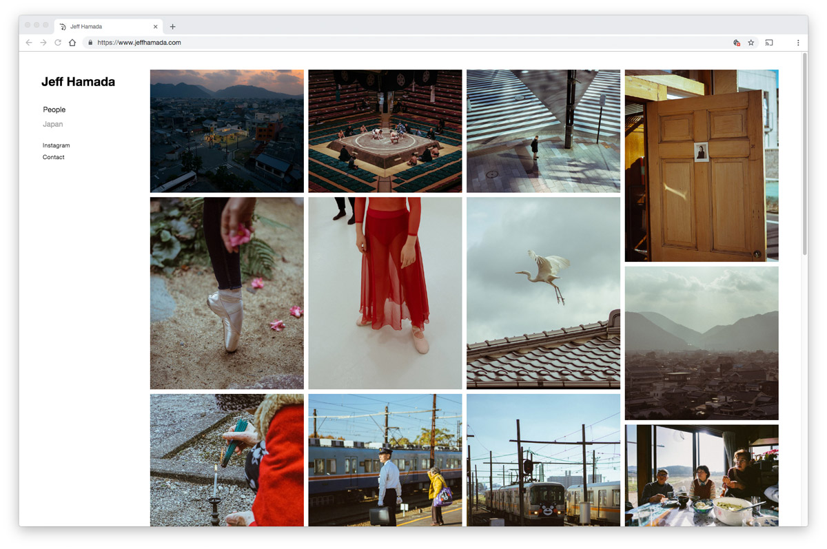
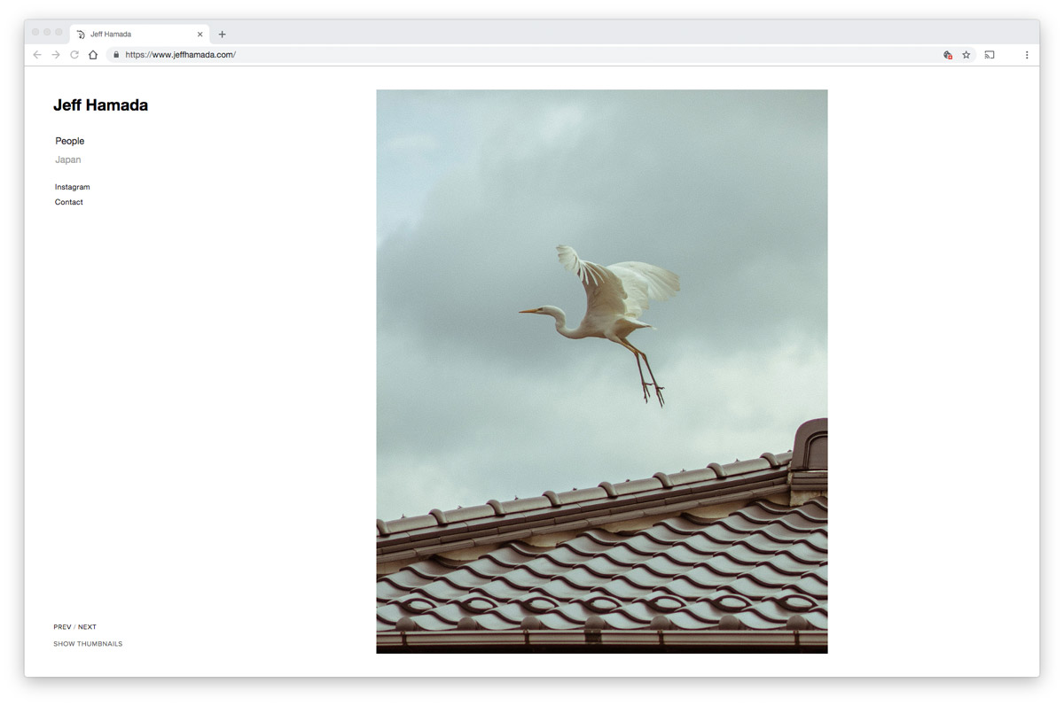
- I always appreciate it when a website gives the option to view single images nice and large, and also view the entire series as a grid of smaller images. This way I can examine the details in an image and then switch views to see how consistent the image feels alongside the other images.
- Simple navigation. I prefer a vertical list with clear headings so I know exactly what I’m going to see when I click on something.
- A bio or contact page with a blurb about the artist, where they’re based, etc. (it’s a bonus if it’s written in third person so I know what pronouns the person uses to identify themselves).
- The ability to move back and forth through an image set using the arrow keys on my keyboard.
Things I don’t like:
- Tiny images.
- Crazy color schemes that distract from the art or photography.
- Sites that are not properly viewable on mobile. If your Instagram bio has a link to your website, make sure it’s mobile-friendly.
- Contact forms! Just give me an email address.
My goal was to create the kind of simple portfolio site I enjoy looking at and it was easy because Squarespace had a template called “Wells”that I could use as a starting point. It was really close to what I was looking for so it only took me a day to set it up (I spent more time exporting photos from Lightroom than I did tweaking the template).
I didn’t find many other templates that I liked as much as this one so I do think there is room for Squarespace to add some more options for portfolios (a lot of the other ones felt like they were more for stores). I’d also love to see more gallery layout options, perhaps one that felt more like an irregular collage with images appearing as you scrolled down. The options they currently have all work really well though. You can check out all the portfolio templates here.
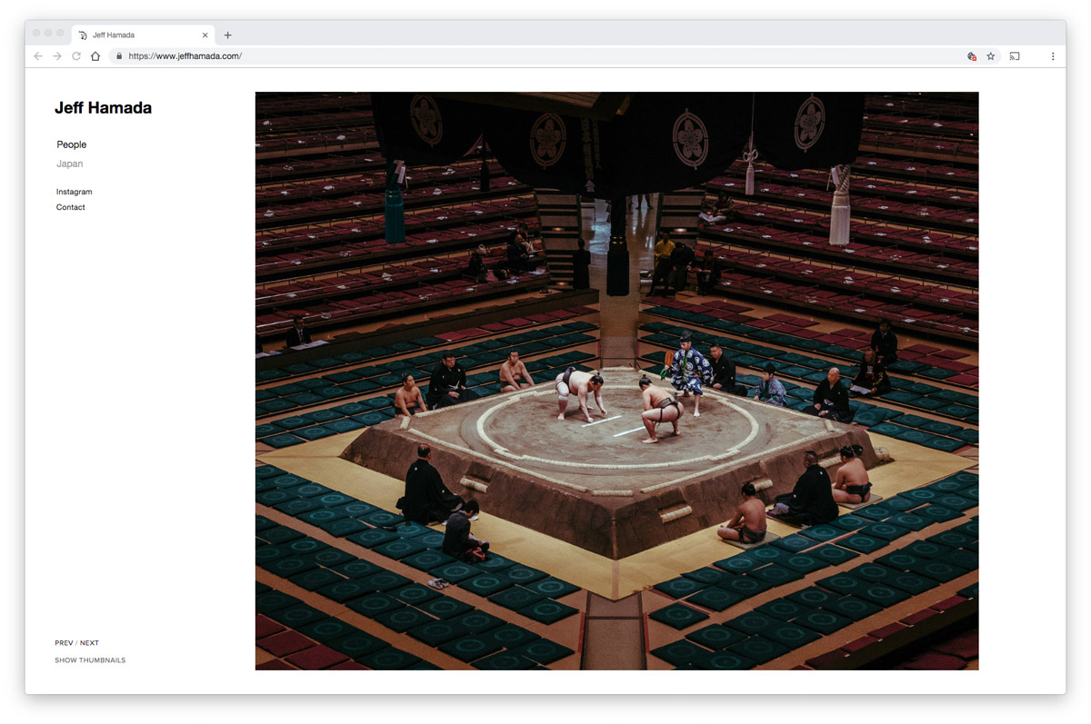
Overall, I’m really happy with my new portfolio site, especially considering how little work it was. It definitely showcases my photos on desktop and mobile a lot better than what I had previously. It was also surprisingly easy to redirect the URL I already owned to point to this the site (clicked one button and updated the nameserver and they have their own domain tools too).
You can check out my portfolio over here and see what you think. If you’ve been procrastinating your own site revamp and you wanna try out Squarespace, you can head to Squarespaceand use the code “BOOOOOOOM” on checkout to get 10% off!
This content was sponsored by Squarespace
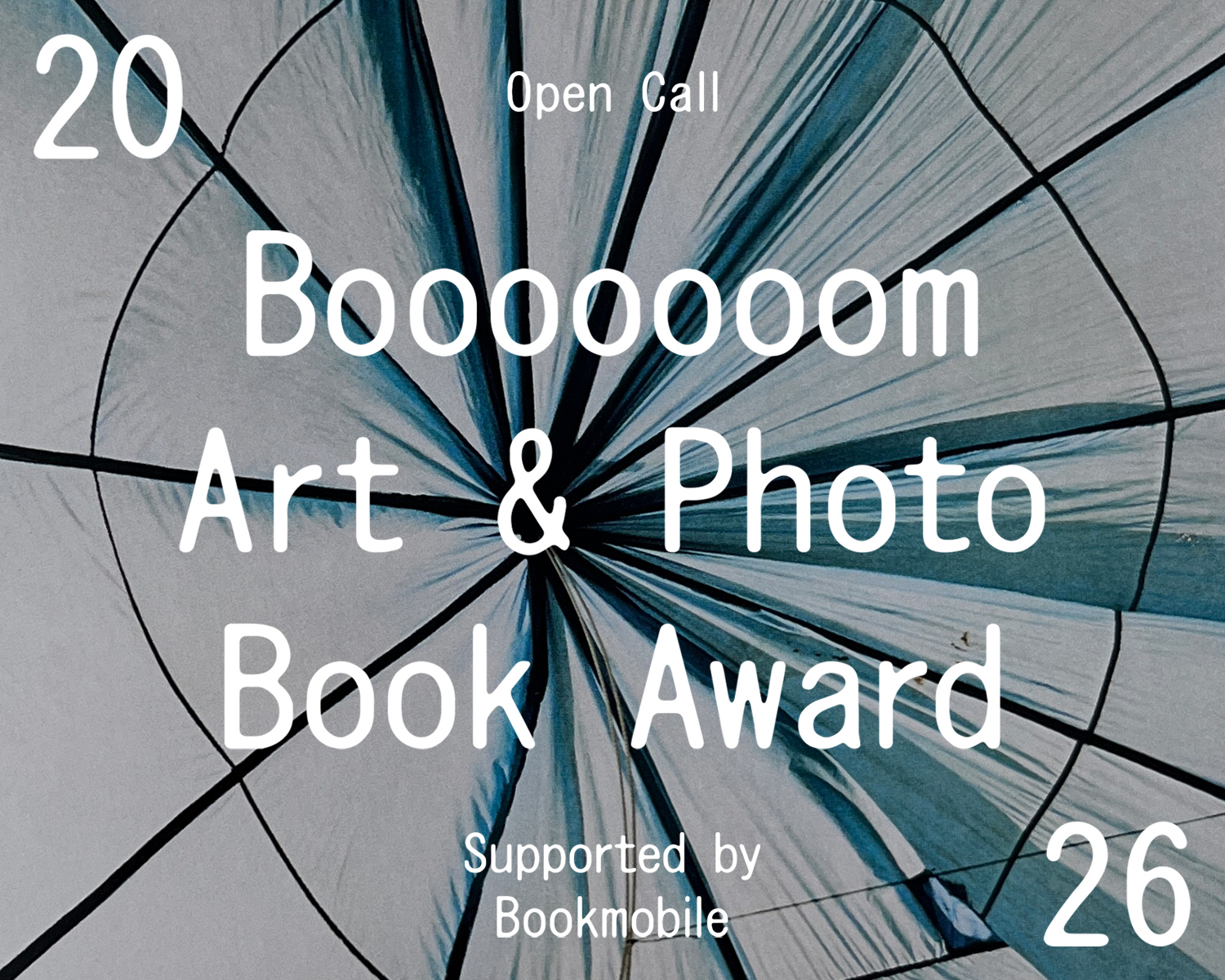
2026 Booooooom Art & Photo Book Award
Wanna turn your art or photos into a book or a zine? Here’s your chance, we’re picking 8 people!
See More
Tomorrow’s Talent 5 Book
This collection brings together work from 60+ artists and is also our biggest volume yet: 276 pages, and for the first time, in a larger format.
Booooooom Shop
Join our Secret Email Club
Our weekly newsletter filled with interesting links, open call announcements, and a whole lot of stuff that we don’t post on Booooooom! You might like it!
Sign UpRelated Articles