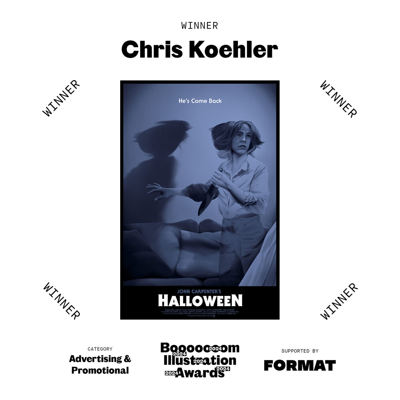
For our first-ever Booooooom Illustration Awards, supported by Format, we selected 5 winners, one for each of the following categories: Editorial, Personal, Product & Packaging, Advertising & Promotional, Student. Now it is our pleasure to introduce the winner of the Advertising & Promotional category, Chris Koehler.
Chris Koehler is an Chinese/Salvadorean/German illustrator from San Francisco. This illustration is an officially licensed poster for the 45th anniversary of Halloween, for Hero Complex Gallery and Compass International Pictures.
A huge thank you to Format for supporting our awards this year. Format is an online portfolio builder specializing in the needs of photographers, artists, and designers. With nearly 100 professionally designed website templates and thousands of design variables, you can showcase your work your way, with no coding required. To learn more about Format, check out their website here or start a 14-day free trial.
We had the opportunity to ask Chris some questions about his work—enjoy the interview below!

Jeff Hamada: What was the first piece of art you saw when you were younger that actually stuck with you?
Chris Koehler: My dad is an art collector, so we’d often visit museums during my childhood. The two pieces of art that left the most profound impression on me were Rodin’s “Three Shades” at the Legion of Honor and William Harnett’s “After the Hunt” at the DeYoung. Rodin’s sculptures are incredibly powerful and raw, almost overwhelming, while Harnett’s still lifes exhibit a level of technical mastery I hadn’t thought possible. These two pieces showed me the outer limits of what could be accomplished in art.
What artwork do you have on the wall in your home? Can you describe a piece?
My wife is an interior designer and she has much better taste than I do, so I take more of a backseat in our home decorations. I do have a couple pieces hanging that are special to me. One is a massive diptych by Roids MSK, one of my favorite graffiti artists, and a screenprint by Ben Shahn, an illustrator who was formative to my art education. I don’t have a lot of wall space in my studio, but I rotate screenprinted movie posters every few months out of the dozens I keep in my flat files. A few of the artists I keep in constant rotation are Barret Chapman, Benedict Woodhead, Jessica Seamans, Daniel Danger, Housebear, and Laurent Durieux. Sometimes I’ll theme a wall in my studio; I recently did all Terrence Malick movie posters. And of course, I always have originals by my daughters nearby.
Love Roids’ work, he is a friend and truly one of the most talented people I’ve ever met. Who are your biggest creative influences currently?
I try not to look to other illustrators or painters for influence these days, I’m terrified of someone else’s voice bleeding into my own. I think it’s more interesting to look to other media to influence. Music is a huge influence, there is no visual to draw from, but the moods and emotions translate so clearly into my work. I had Philip Glass’s score for Mishima in constant rotation this year and I can feel the vibe of those themes in every piece I made. I’m also greatly influenced by cinematography. Stanley Cortez’s work in The Night of the Hunter influenced me more than any illustrator, and more recently I’ve been obsessed with the graceful naturalism of Emmanuel Lubezki.
As far as other illustrators, my Billing Bloc collective inspires me with their dedication and creativity. We all work in our aesthetic lanes, but seeing how hard everyone pushes sets a really high personal standard for my own work. I have to work to my limit just to keep up!


How would you describe your aesthetic to someone who has never seen your work?
Like a lot of artists, I have no clue what makes my work distinct. I suppose every artist is unique by virtue of every person being unique. I try to make work without artifice or pretense, so I would describe my aesthetic as “someone who is just trying their hardest”. Perhaps the biggest visual marker of my work is a result of my colorblindness – I prefer to work in limited palettes that I can understand in terms of simple color theory, since I have a hard time understanding color intuitively. That being said, I tend to make work that is detail oriented and moody, which is also how I would describe myself.

Can you share a bit about the process of creating your winning image, from the initial seed of the idea to the final version?
Halloween is a movie that holds a special place in my heart. The first official movie poster I ever created was for its 40th anniversary, and I’ve revisited it several times since. When Hero Complex Gallery asked me to design a piece for the 45th anniversary, it felt like my career was coming full circle. My process always begins with thumbnails, and for this project, I sketched out a few pages of mostly terrible ideas. Among the dreck, two concepts showed potential, and I chose the more risky and ambitious one.
Years ago, I read about the effect of the Mona Lisa’s smile. From a distance, we perceive the shadow shapes first, making her appear to smile. As we get closer, the details reveal a different expression. This concept involves overlaying two images: one in broad value patterns and the other in detailed rendering.
I always wanted to try this conceptual framework in a movie poster. Posters and large-scale illustrations are unique because they are first viewed from a distance, and as the viewer approaches, the details resolve, clarifying the image. This format is perfect for a double read, and the Halloween poster was my chance to test this idea.

Between the thumbnail and tight sketch phases, I conduct extensive research. I often watch the movie several times, take dozens of screen captures, look for production stills, shoot my own photos, and even build 3D models if necessary. For this piece, I needed very specific reference images since the shadows had to form a separate image, and the pose had to be precise. My wife posed for the body in a matching outfit, I had images of Jamie Lee Curtis’ head, and I freestyled the rest to create the face of Michael Myers’ iconic Shatner mask. Using this reference, I developed a tight sketch for approval. Most of my poster work is screen printed, so I define the color palette based on the number of screens I plan to use—in this case, five colors. From there, it was just a matter of rendering each element until the artwork was complete.
The funny thing about this piece is that it hinged on a particular illusion that wasn’t coming through while I was working on it. At the 90% mark, the illusion still wasn’t working, and I was ready to tell the gallery I had to abandon the piece and change direction. Fortunately, I persevered, and the tiniest details, like the creases in the pants and the angle of the pillows, made all the difference. That’s the exciting part of illustration—walking the tightrope between disaster and success, not knowing if you can pull it off until it works at the eleventh hour.

Where do you feel you are at in your creative journey?
I’ve been illustrating for a little over twenty years and I still feel like I barely know what I’m doing. The second I think I have it figured it out, the industry changes under my feet and it’s back to the drawing board. And there’s always a crisis to adapt to. When I graduated art college it was stock illustration, later on it was the creative gig economy, and now it’s generative AI. I’ve learned to take these extinction level events in stride and lean into my own instincts and interests and just keep putting one foot in front of the other. The most gratifying part of the job is that you never stop learning, you never have to stop getting better, and the journey to find yourself doesn’t stop until you close your eyes for the last time. I’m finally at a point where I’m at peace with my progress and my work, where the frustrations of inadequacy are equally tempered by the joys of the process. This is all to say that for as far as I’ve come I still have a long way to go.
What’s one piece of good advice someone gave you, and who said it?
I asked my mentor in college, the great John Hersey, how he got to be so successful. He simply said “I just kept going until everyone else around me stopped.” That became my mantra.

What is the most interesting thing you’ve seen, heard or experienced recently?
2024 has been such a killer year for horror movies, Oddity and I Saw the TV Glow are probably going to top my year end list. In the art world, Spoke Arts’ recent Wes Anderson show was fantastic. Moor Art Gallery out of England has been putting out some killer pieces as well, I hope to work with them in the new year!
Ya great year for horror. The Substance (obviously) and I also liked Strange Darling. What else are you hoping to accomplish this next year?
I’ve been working on a children’s book pitch for a while, I’m looking forward to getting that out in the wild and seeing if I can get it published. I’m also hoping to get back to teaching college! I also want to focus on more writing and longer form book projects. Otherwise, I just want to see where illustration and life takes me.
What about one thing you hope to accomplish in your lifetime?
The longer I do this the more I realize that the journey is what matters, as cheesy as that sounds. Ultimately, I just want to live a good quiet life and enjoy watching my kids grow up. If my silly drawings can bring joy, empathy, or meaning into someone else’s life, well that’s just the icing on the gravy.
A Letter From the Founder: Introducing Booooooom Studio
Making the work we’ve already been doing more official and, ideally, get a lot more of you involved.
Learn More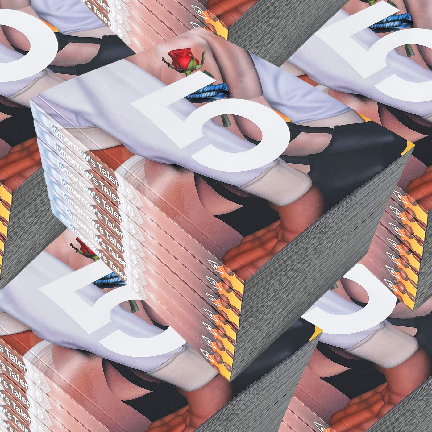
Tomorrow’s Talent 5 Book
This collection brings together work from 60+ artists and is also our biggest volume yet: 276 pages, and for the first time, in a larger format.
Booooooom Shop
Join our Secret Email Club
Our weekly newsletter filled with interesting links, open call announcements, and a whole lot of stuff that we don’t post on Booooooom! You might like it!
Sign UpRelated Articles